Visualization of Project Data in Construction. Basic Data Visualization Tools. 📚 8 Lessons
Enrolment validity: 0 day
Description
In this course, we will step by step, using the example of real data, we will go through the main processes related to the topic “Big data and machine learning”.
🎓 In this fourth part:
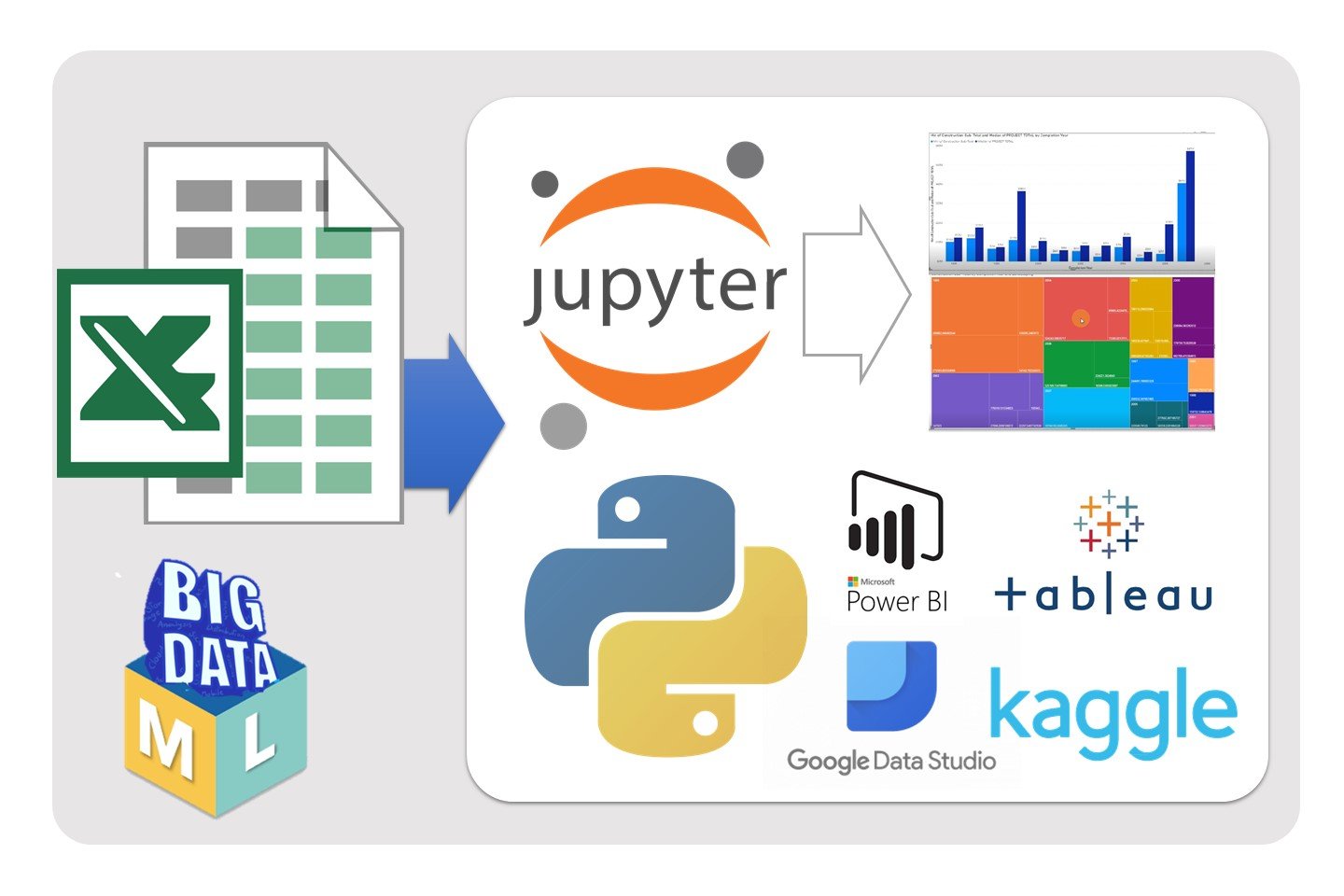
✔️ we will look at the main platforms for visualizing Big Data and consider the main Data Visualization Online-Tools for Big Data. We will briefly look at these platforms and generate several reports in each of the platforms.
This will give you the opportunity to choose the right platform that suits you and your data.
✔️ In practical lesson we exported an excel file with our data to the Kaggle platform and using a Jupyter Notebook we cleared the data and visualized the data using different python libraries.
📚 You will be guided through the basics of using:
- Jupyter Notebook
- PowerBI
- Tableu
- Google DataStudio.
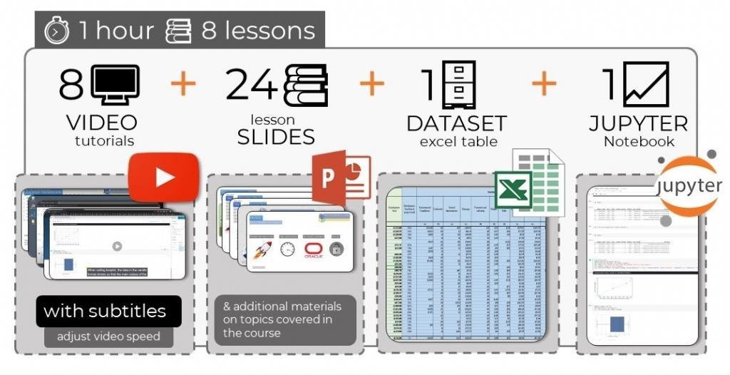
🔎 Topics covered in this course:
- What is Business Intelligence?
- Data Visualization Tools
- Was ist Business Intelligence? Was ist BI?
- Jupyter Notebooks as a Custom Calculation Engine
- Machine Learning Visualizations made in Python
- Export data from Excel to Python
- Uploading data to Visualizations on Kaggle
- Introduction to Jupyter Notebooks
- Prepare data for Visualisations
- Clean data for Visualizations
- Use Pandas in Jupyter Notebook
- Data Cleaning With Pandas
- Visualization with Seaborn and Matplotlib
- Data visualization by Heatmaps and Scatter plots
- Python Treemaps with Squarify
- Three-Dimensional Plotting in Matplotlib
- Pros and Cons of Power BI
- Import an Excel file into Power BI
- How to Get Started
- Treemaps in Power BI
- Creating Reports in Power BI
- Pros and Cons of Tableau
- Import an Excel file into Tableu
- How to Get Started in Tableu
- Treemaps in Tableu
- Creating Reports in Tableu
- Creating Dashboards in Tableu
- Pros and Cons of Google Data Studio
- Import an Excel file into Google Data Studio
- How to Get Started in Google Data Studio
- Treemaps in Google Data Studio
- Creating Reports in Google Data Studio
- Creating Dashboards in Google Data Studio
What Will I Learn?
- What is Business Intelligence?
- Data Visualization Tools
- Was ist Business Intelligence? Was ist BI?
- Jupyter Notebooks as a Custom Calculation Engine
- Machine Learning Visualizations made in Python
- Export data from Excel to Python
- Uploading data to Visualizations on Kaggle
- Introduction to Jupyter Notebooks
- Prepare data for Visualisations
- Clean data for Visualizations
- Use Pandas in Jupyter Notebook
- Data Cleaning With Pandas
- Visualization with Seaborn and Matplotlib
- Data visualization by Heatmaps and Scatter plots
- Python Treemaps with Squarify
- Three-Dimensional Plotting in Matplotlib
- Pros and Cons of Power BI
- Import an Excel file into Power BI
- How to Get Started
- Treemaps in Power BI
- Creating Reports in Power BI
- Pros and Cons of Tableau
- Import an Excel file into Tableu
- How to Get Started in Tableu
- Treemaps in Tableu
- Creating Reports in Tableu
- Creating Dashboards in Tableu
- Pros and Cons of Google Data Studio
- Import an Excel file into Google Data Studio
- How to Get Started in Google Data Studio
- Treemaps in Google Data Studio
- Creating Reports in Google Data Studio
- Creating Dashboards in Google Data Studio

